Hongzhi Designer analyzes list and grid layout of APP
Time:2018-06-04 00:54:28
When we talk about how to make a good user experience in design, there will be thousands of mobile UI design patterns to choose from, which has both advantages and disadvantages. On the one hand, we can have a lot of choices to satisfy our users and give them a good user experience. On the one hand, when we do prototyping, we may eventually fall into the same debate as using grids or lists. in. Today's article lets us discuss in depth, list and grid, which one is more suitable for your UI design?

Regardless of the design pattern you choose for a mobile application or website, the final interface should be meaningful to the user while reducing unnecessary trouble. With this in mind, let's analyze the lists and grids to see what advantages and disadvantages each has when it comes to different content and information.

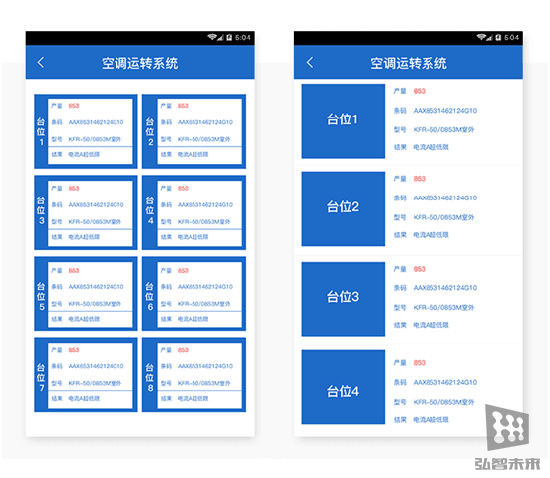
(The grid is on the left and the list is on the right)
Grid layout
The grid, which is characterized by a number of cell groups, is separated by blank columns. In some mobile phone APPs and websites, such design is very common. In the example on the left, the blanking gaps are cut horizontally and vertically, and the gaps are adjustable, and they can be resized to fit your needs.
In general, grids are used to divide screen space into cells of the same size, making navigation easier to understand. The beauty of grids is that they can be customized and make your design more orderly.
Other benefits of the grid include:
1. Effective use of space and structure
2, the grid can be more visually harmonious
List layout
The layout of the list is different from the grid layout. This navigation pattern is simply composed of one element and another element arranged in alphabetical, numerical, or even random order. List layouts can be found in almost all APPs. When using vertical scrolling menus, they are very suitable for user operation and reading. Lists can have many different variations, such as the product list above or even a drop-down menu. The list takes up less space than the grid, so if the text content is large, using a list layout is a good choice.
Other benefits of the list include:
1, suitable for efficient browsing
2, better performance when the screen space is less
Now let's look at the display of different content forms on the device. The use list is also a grid.
List vs Grid: Content Consumption

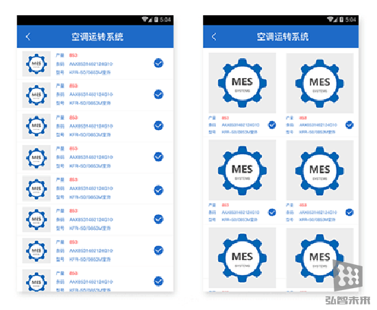
In our example, the grid is compact and contains picture and text elements. This combination is very usable due to the same size of each block in the grid, which makes everything easy to read and visually pleasing.
Grids are more common in UI design. With the popularity of responsive Web design, grids are now everywhere. When it comes to displaying cards or designing a task-based mobile app, grid design can help you better; but when it comes to content consumption, the grid becomes less effective because of the large structure. It does not allow designers more space to display additional content information.
If the content is displayed in a minimalistic way, the grid will produce good results. If you have a lot of content to show, then the list will help you to present more content and more visual elements throughout the page. As can be seen from the above example, although the appearance of the grid is more attractive, it takes more space than the list.
List vs Grid: Content Scrolling

If you are looking at content, which is better? List or grid? In the above example, on the left, you will see a page that uses a grid. As mentioned above, it occupies the entire screen. This is a good way to emphasize navigation because it is more clear and clear. It adds image content. Ease of use, each piece of the grid has rich content for users to browse.
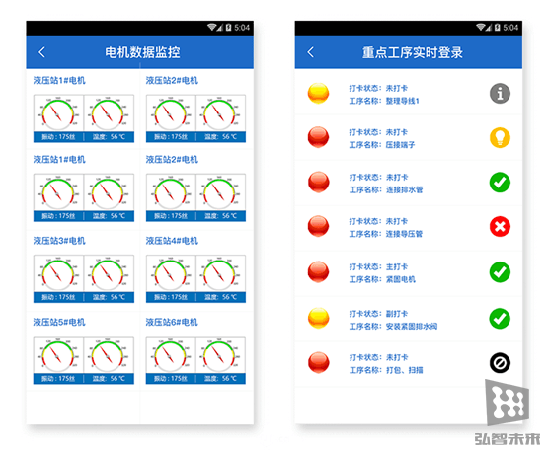
When you want to display a variety of data or graphs, the use of grids is very good, because the grid distinguishes related content blocks in a streamlined manner, which allows users to focus on a certain piece of content until they see Scroll down or up after scrolling through the content.
to sum up
No matter which navigation style you choose, no matter which design method you choose, you should choose simple user flow, clear visual effects and simple design as the standard to help users get the best experience. After all, you are designed for your users!


