Give your designs a little color to see
Time:2022-05-20 08:40:08
Design is a field that is constantly evolving and changing. Often times, a seemingly familiar design trend will change in the next moment and surprise you again. Flexible creativity and open-mindedness can often transform mundane elements into stunning designs.
Color is the soul of design, and the harmony and beauty it brings will be very comfortable visually, and it will always capture people's hearts at the first time. The use of color in design:
1. The collocation of adjacent two colors is simple and effective
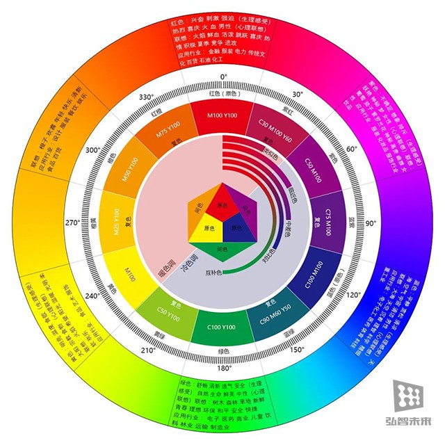
Take two adjacent colors on the hue circle, which is what we call the same color system. This is a relatively conservative but very effective color matching method.

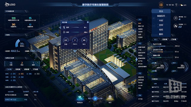
The application of the same color system on the large visual screen is very extensive, which can not only unify the color matching of the screen, but also reflect the overall unity. However, this color scheme is easy to form a monotonous and boring taste, so there are some changes in brightness and purity, and the contrast in area can be strengthened to make the picture more balanced.


2. the auxiliary color makes the picture more full
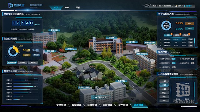
In the design, the main function of the auxiliary color is to highlight the main color and better reflect the advantages of the main color, and make the whole picture more full while conveying the information. While emphasizing and highlighting the main color, the auxiliary color must also conform to the style that the design needs to convey, so as to maximize the function and meaning of the auxiliary color.

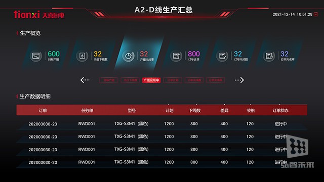
The main color of the interface is more lively, and the use of blue auxiliary color can make the whole interface more stable
3. the embellishment color is the finishing touch
The characteristics of the embellishment color are mainly small area, clear hue, and eye-catching and prominent. Due to the characteristics of the embellishment color itself, its function is usually reflected in the details.

4. Saturation and Brightness
Case 1: Use low saturation, low lightness
High-level colors are restrained. Design works with low saturation and low brightness look more integrated, with more harmonious tones, and have a strong connection with each other, making users feel more gentle, less fatigued, and giving people a strong sense of of quality and luxury.

Case 2: Use high saturation, high brightness
High-saturation and high-brightness colors are easier to attract people's attention, but it is easy to cause visual fatigue, which is not conducive to visual output and affects the overall effect of the picture. Therefore, we should use colors with higher saturation and lightness for the design of buttons or in the direction that the user is more concerned about.

Design trends are changing all the time. When following trends, it is necessary to flexibly express more effectively according to customer needs. We have been moving towards a clear design goal: typography layout, color, interaction, and dynamic effects are all indispensable; taking into account both visual and functional, following trends without blindly following, and creating a better experience for customers.
Hongzhi is willing to use professional technology, first-class quality and perfect service to empower the digital informatization construction of manufacturing enterprises.


